When I started selling templates in 2013, my product photos were taken on the kitchen table with a borrowed camera and whatever light came through the window at 4pm, which in Vilnius in November is a kind of grey soup. The first template that sold well sold well partly because a blogger shared my photo of it, and the photo was terrible. It worked anyway, and that confused me for years. Here’s what I know now, after thirteen years of shooting every template myself.
The whole studio fits in a corner
My setup has been the same since 2016 and it cost under 300 euro total. A white foam board from an art shop, 70 by 100cm, maybe 8 euro. A roll of photographer’s background paper in a soft warm grey, about 25 euro, taped to the wall and falling onto the table so the curve is gentle instead of a crease. A tripod, the cheapest sturdy one, because sharpness is the whole difference between homemade and professional-looking. And a 50mm f/1.8 lens, the famous plastic fantastic, which I bought secondhand for 90 euro and have never needed to upgrade.
No studio lights. A large north-facing window, the kind that gives soft even light on a cloudy day, is better than any softbox I’ve tried. I shoot between 10am and 2pm and turn every other light in the room off, because mixing window light with warm ceiling bulbs gives the skin tones and paper colors that muddy yellow cast I spent 2014 editing out.
One white board does the work of three
The foam board is the most useful tool in the studio and the cheapest. Lay a flat lay on the table, put the board on the camera side, and it bounces window light back into the shadows. That single move is why shop photos look bright and open while amateur ones look dark on one side. For laptop and screen shots I prop the board behind the setup as a plain background, and for detail shots I lean it against the window to soften the light coming through.
When the light is harsh, which happens in June, I tape baking paper over the window as a diffuser. Total cost of that fix: 1 euro 50. The depth of field discussion people have about lenses matters less than any of this. A cheap lens in good light beats an expensive one in bad light every single time.
Styling: three props, always
Every product photo I’ve ever regretted had too many things in it. My rule is three props maximum: one paper thing (notebook, planner page), one cup or glass, one small object with a texture (linen, a plant leaf, a pen). The template screenshot is the subject. Everything else is there to make the eye land on the screen and stay.
I keep a shelf of the same props for every launch now, which sounds boring and is the reason my product photos look like a family. A buyer who clicks through five of my templates should feel the same room behind each one. Consistency is doing that work, and it costs nothing once the shelf exists.
The colors matter more than the objects. My palettes live in a little notebook: warm neutrals for the soft templates, one accent color per photo that matches the template’s own accent. When I shot the pink ones in 2013 on a pink background, nobody could tell where the template ended and the photo began.
The shot list I run every launch
Six photos, in the same order, every time. First, the hero: the template on a laptop, angled slightly toward the window, shot from just above eye level. Second, the styled desk flat lay with the template on the screen or as a printed moodboard. Third, a detail shot: a crop of the typography or the header, close enough to read. Fourth, a mobile view, phone propped against a book. Fifth, a working shot: my hand on the trackpad, notebook open, no face. Sixth, the in-use shot on my own blog, so buyers see it live.
Six is enough for the shop page, the email, and a month of social posts. I used to shoot forty photos per launch and use nine.
Launch day runs on a script
Photography used to swallow my launch days whole. I’d shoot in the morning, get pulled into support mail at noon, edit at night with tired eyes, and upload whatever survived. Now the whole thing is scheduled and the schedule is always the same.
The template goes on my own blog the night before, so the in-use shot is already done when the camera comes out. I spend 40 minutes on the setup: table against the window, paper up, board in place, props off the shelf, laptop charged and styled. The shoot itself takes about 30 minutes for all six angles, because the frame is the same as last time and only the product changed. Two or three test frames, look at them on the laptop screen rather than the camera back, fix the light, then the real ones.
Editing happens the same afternoon while the setup is still standing, in case I need a reshoot of one frame. I’ve needed a reshoot exactly four times in the last five years, and every one of those was a photo where the laptop screen glare hid the header. Screens and daylight have a feud and the screen loses.
The photos sit in a dated folder, exported and named, before I touch the shop page. When the listing goes live, the images are the finished part of the day. That order matters for me more than any camera setting, because photography is the part of a launch I can only do when the light is right, and mail can wait an hour.
Editing is where they become mine
Everything goes through Adobe Lightroom with one preset I built in 2018 and have tweaked maybe five times since. Exposure up, whites up, a small warmth shift, straighten the horizon (nothing says amateur faster than a tilted table), and a slight vignette. Batch the preset across the whole launch, then fix the two or three photos it didn’t suit.
What I edit out: crumbs on the table, dust on the laptop lid, the cable I forgot to hide, and any shadow edge that draws a line across the template. What I leave in: the crease in the linen, the dent in the notebook, the imperfect cup. Polish on the surfaces, honesty in the objects.
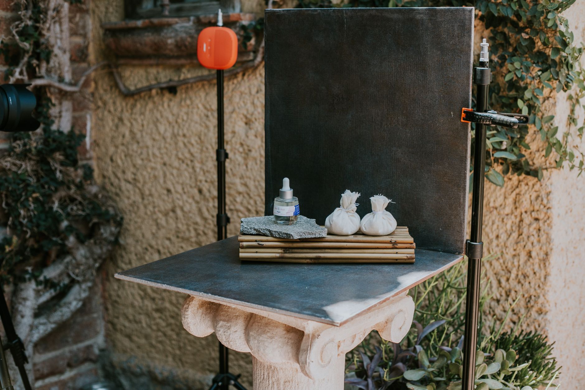
The phone gets used too, just never for the shop page. I’ll grab a behind-the-scenes frame of the setup itself while I’m shooting, the kind of photo that shows the foam board and the taped paper, and it does better on social than any polished product shot I’ve ever posted. People like seeing the corner where the work happens. Editing on the phone is one Lightroom mobile preset, the desktop one’s little sister, so the two feeds still match.
Export at 2000px on the long edge, about 82 percent quality, and name the files with real words. shop-name-template-name-hero.jpg is better than IMG_4821.jpg for everything from search engines to my own sanity when I’m hunting for a photo in 2027.
What I’d tell a designer shooting today
Start with the window and the white board and skip everything else until you’ve done ten launches with those. The photos will be better than 90 percent of what’s in the template market, and the 300 euro setup will survive longer than any camera you’re tempted to finance. Shoot the same six angles every time, keep the prop shelf small, and let the consistency do the branding.
The photograph’s job is to make someone feel the calm their blog could have. Everything in the frame is either helping that feeling or getting in its way.