Category: General

What I’d Do Differently If I Launched the Shop Today

I opened the shop in 2013 with nine Blogger templates, a clunky payment button, and a lot of hope. The whole thing fit on one kitchen table. Six templates were pink. I sold my first copy to a woman in Portugal within a week and celebrated with the good chocolate.

Thirteen years later I still sell templates, from the same kind of table, with a much better desk lamp. When people ask what I’d change if I started over, the honest answer is quite a lot. This post is the letter I’d send to the designer I was at 26.

I’d price the templates properly from day one
Close-up of a blank white price tag on textured beige fabric, ideal for branding use.
Photo by Andrzej Gdula on Pexels

My first themes were 9 euro. I thought cheap meant kind. What cheap actually meant was that I needed to sell sixty copies a month to pay for groceries, and sixty copies a month meant constant launches, constant marketing, and constant design work at speed.

A good theme saves a blogger weekends of fiddling. Mine now cost 49 to 79 euro and people thank me for the price. Undercharging didn’t bring me more grateful customers either; the cheapest buyers were the loudest in my inbox, historically speaking.

If I launched today, I’d research what established theme shops charge and price within a few percent of them from day one. I’d also charge for updates properly. For two years I rebuilt every old template by hand for free each time WordPress moved the goalposts, which brings me to my next point.

I’d write the documentation before the launch

paper, writing, old, antique, write, letter, text, retro, pages, handwriting, writer, words, documents, macro, parchment, to blog, writing, writing, writing, writing, writing, words
Photo by Nile on Pixabay

A template shop turns out to be a support business with a design habit attached. In my first year I answered the same eleven questions hundreds of times. How do I change the header. How do I add my photo. Why did my sidebar jump to the bottom. Where did my fonts go.

Each email took ten minutes. Forty emails a week is a full working day spent typing, and it’s the day I wasn’t designing.

Now every theme ships with a written guide: setup in order, a screenshot per step, a page of common fixes, and a short video for the fiddly parts. Support volume dropped by more than half the month I started shipping guides. If I launched today, the documentation would be written before the first product went live. I’d treat it as part of the design.

I’d carry fewer designs and finish them harder

people, father, daughter, smile, happy, hug, carry, love, field, beard, cap, child, outdoors, countryside, happiness, fathers day, people, father, father, father, father, father, smile, smile, happy, happy, happy, hug, happiness, fathers day
Photo by StockSnap on Pixabay

At one point the shop had 34 products. Thirty-four. Variations of variations, a couple of seasonal layouts, three templates that existed because one customer asked for them and then she never bought one. Catalog sprawl is the slow death of a small shop, because every extra product needs updates, screenshots, support answers, and a place in the menu.

The best sales quarter I ever had came the year I retired eleven products and rebuilt the remaining ones properly. Fewer choices made the shop look more confident, and confidence sells design. Today’s version of me would launch with five themes, each of which I’d actually use on my own blog.

Marketplaces or my own shop? Both, in that order

For about three years I sold only on my own site. Then I listed two themes on a big marketplace and made more in a month than I usually made in a quarter. The audience was already there, already browsing with a card in hand. My commission was real, but so was the volume.

What I’d do today is exactly what I ended up doing anyway, except sooner. Launch the newest work on a marketplace where buyers already gather, keep the back catalog and the custom work on my own shop, and let the two feed each other. The marketplace sends strangers. The shop is where strangers become regulars, and regulars are the ones who buy the 2,000 euro custom packages.

The one caution I’d shout at my younger self: read the marketplace terms twice. Exclusivity clauses, commission tiers, and update obligations are where the margins live.

I’d also keep one design exclusive to my own shop at all times. When a marketplace shows buyers everything I make, my own site needs to hold something they can only get by knocking on my door.

I’d build the email list on the first day

For four years my only marketing was a blog sidebar and hope. The launch that changed things was the first one I sent to an email list. It was 400 people. It sold better than the launch before it that went to 20,000 Pinterest viewers.

A list is the only audience a small shop owns. Pinterest can change the algorithm. A marketplace can change the commission. My newsletter is just mine. I’d put the signup box in the very first template I sold and offer the next theme free to anyone who runs a small blog, because that’s the audience I want anyway.

What actually changed since 2013

The world my first templates lived in is gone in a few specific ways.

Phones took over, which pushed me into responsive web design properly. In 2013 I designed for laptops and apologized to phone readers. Now I design for phones first and the desktop is the special case. WordPress also changed under my feet: the block editor arrived and suddenly every theme needed to work with blocks, patterns, and site editing instead of a fixed set of page templates.

Buyers changed too. A hobby blogger in 2013 wanted a pretty sidebar and a custom favicon. Today she wants a shop, a newsletter, a link-in-bio page, and page speed scores that don’t make her cry. She also finds me through search or an Instagram share instead of a blogroll, so every product page has to read well to someone who has never heard my name.

What hasn’t changed: people buy a template because they can already see their own words living inside it. The screenshot that sells is the one with real content in it.

I’d run it like a studio from the start

For the first two years I had no contract, no invoice numbering, and a shoebox of receipts. My first custom client paid me four months late because I’d never actually told her when payment was due. Embarrassing, and entirely my doing.

Today every custom project starts with a signed brief, a deposit invoice, and payment terms written in plain language on the invoice itself. The boring paperwork is what lets me be cheerful about the creative part. (The fees on card payments come out of my rates as a matter of course, so they never become a conversation mid-project.)

I’d protect the calendar and the hands

In 2016 I worked eleven weeks without a day off, wrapped around launch deadlines I’d set for myself and could have moved. My wrist hurt for a month afterwards. That was the year I learned that a small shop has exactly one asset that cannot be replaced, and it sits at the end of my arms.

Now the studio runs on four-day weeks and two launch seasons a year. Everything still gets done. It just gets done without the 2am panic I used to treat as proof I cared.

What I’d keep exactly as it was

Plenty of it. The hand-written thank-you notes in every package download, the free templates for students, the Friday afternoons I spend making mood boards with no commercial purpose at all. The kitchen-table energy of the first year, which I’ve worked to keep even though the table got bigger.

If you’re standing where I stood in 2013, the short version is this: price like the work matters, write the guide before you launch, keep the shelf small, collect email addresses from day one, and get the money terms in writing. Do those five things and the rest of it, the fonts and the palettes and the pretty, is the easy part. It’s also the part that made me open that shop in the first place, and I’d do it all again. Just with better prices.
Media Kits: What Brands Actually Look At

Every few weeks a blogger writes to ask what goes into a media kit, usually a week before a brand asks to see one. I’ve designed dozens of them in my studio, and I’ve also been on the receiving end as a small brand myself when I commissioned photography for a template launch. That second view changed how I build kits.

A media kit is your blog’s shop window for partnerships. One PDF that tells a brand who reads your blog, how many of them there are, what a collaboration with you looks like, and what it costs. Done well, it answers every question in a pitch email before the brand has to ask it.

Here is what I put in mine, page by page.

Start with the cover

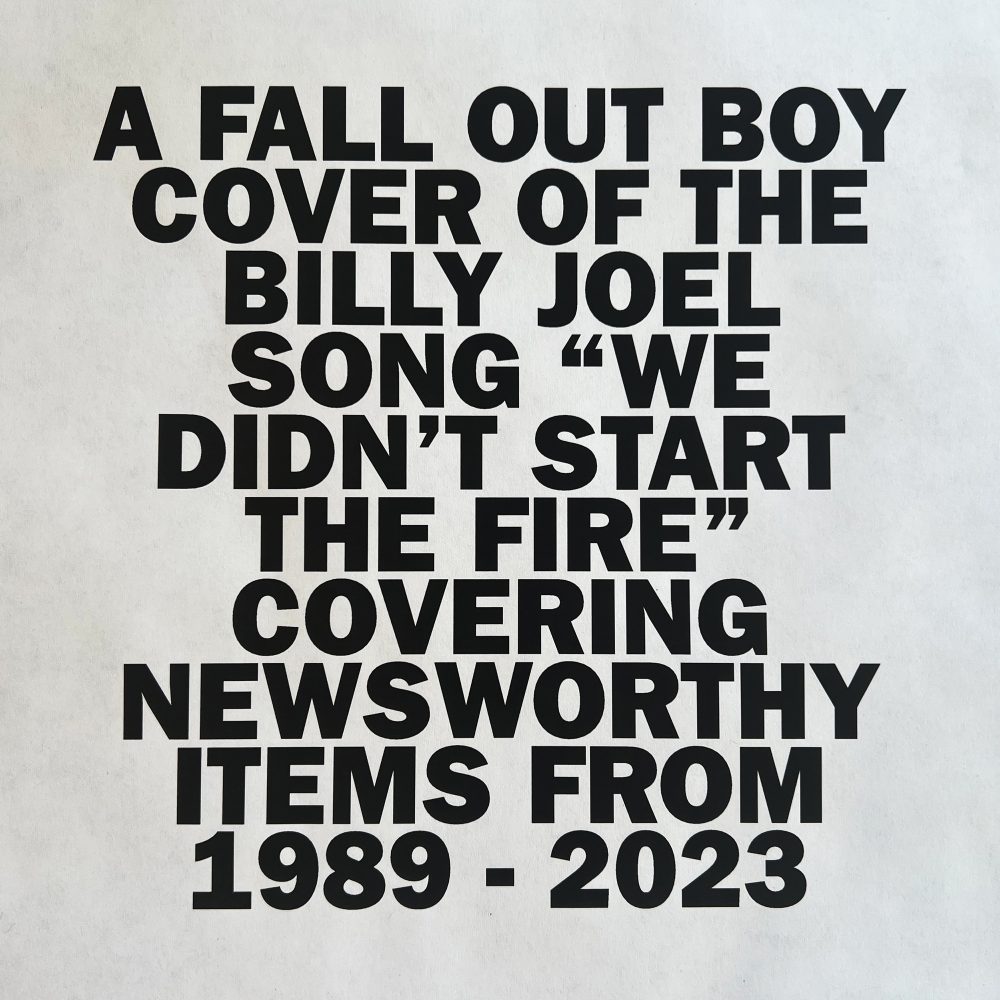
Cover of Fall Out Boy's 'We Didn’t Start The Fire'
Photo by Fall Out Boy on Wikimedia Commons

The first page is a mood board with your name on it. Your blog name, a one-line description of what you write about, your headshot or a signature photo from your blog, and your contact details. Nothing else.

I keep a running folder of images that feel like my blog: a desk flat lay, a type sample, a color swatch. The cover pulls two or three of those together so a brand sees your visual style in three seconds, before they read a single number. First impressions do real work here. A brand manager skims forty kits in an afternoon, and the pretty ones get opened twice.

The second page is you

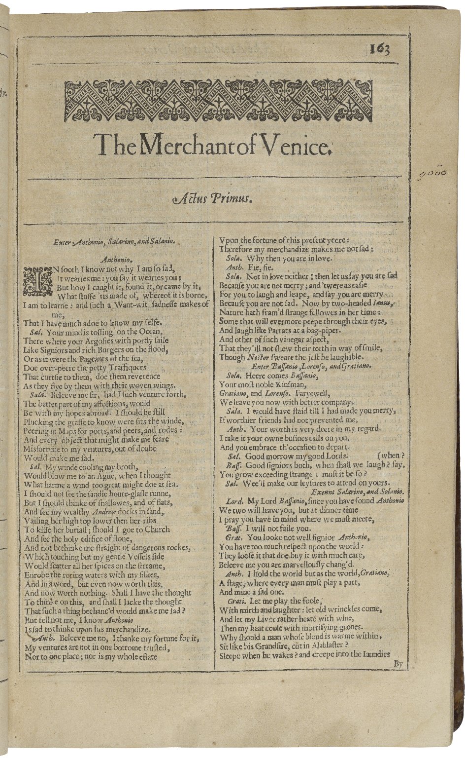
Second Folio Title Page of the Merchant of Venice
Photo by William Shakespeare, Thomas Cotes (printer) and John Smethwick (publisher) on Wikimedia Commons

Half a page of bio, written like a person wrote it. Who you are, what your blog covers, what makes your corner of the internet specific, and roughly how long you’ve been at it. Mine mentions that I design templates from a home studio and that my readers are hobby bloggers building their first pretty site.

Add the practical facts brands need for their records: your name, email, location or time zone, and the languages you work in. If you have an agent or a manager, that goes here too. Keep it short. The numbers come next, and numbers are what the second half of the skim is hunting for.

Your numbers, honestly

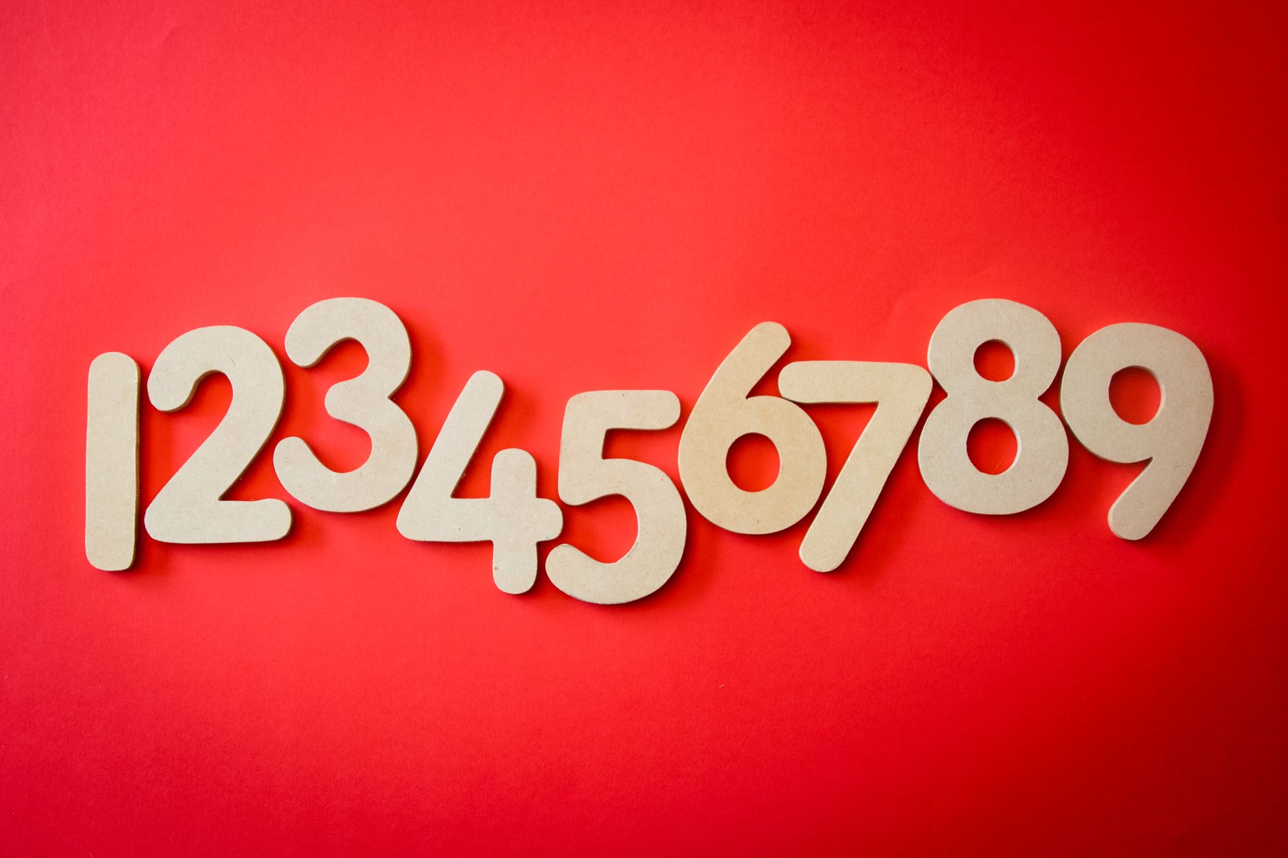
Creative display of numbers one to nine on a vibrant red background, ideal for educational materials.
Photo by Magda Ehlers on Pexels

This is the page brands actually study, so give them real figures with dates attached. I update mine every quarter and write “figures from March 2026” at the top, because a kit with stale numbers is worse than no kit.

What to include:

  • Monthly pageviews and monthly unique visitors, taken from your analytics. Say which tool you use.
  • Domain rating or authority score, if you track it.
  • Email list size and average open rate. A 2,000-subscriber list with a 45% open rate is genuinely valuable, and brands know it.
  • Social following per platform, plus average engagement on recent posts. Followers count for less than they used to; interaction counts for more.
  • Traffic sources. A brand would rather see 60% of your readers arrive from search and newsletters than 60% from a single viral pin.

Round nothing up. Brands cross-check kits against public numbers all the time, and one caught exaggeration ends the conversation.

Who your readers are

Numbers tell a brand how many people. This page tells them which people.

Age brackets, gender split, top countries, top cities if you have them, and one or two sentences about what your reader is looking for when she lands on your blog. Mine reads roughly: women 25 to 44, mostly in the UK, US, and the Baltics, building hobby blogs beside day jobs and children.

Pull the geography and age data straight from your analytics rather than guessing. Then add the soft detail only you know: what topics take off, what your readers ask for in comments, what they buy. That soft detail is the part a media kit template can’t give anyone, and it’s usually what makes a brand lean in.

Past work, shown properly

Three collaborations is plenty. For each one: the brand name, what you made together (a sponsored post, a styled photo set, a newsletter feature, an ambassador season), and one result you can point to. Results beat adjectives. “The recipe post brought the brand 340 email signups in ten days” works harder than any amount of “amazing campaign.”

One small honest case study is worth five logo tiles. If you’re new to sponsored work, use near-misses instead: a product you bought and wrote about anyway, a giveaway you ran with a shop you love, a design project you did in the brand’s space. Show the format you’d make for them.

What a collaboration includes, and what it costs

The rate card page. List your packages as products: sponsored post, post plus social bundle, newsletter feature, a short run of stories, a styled photo set for the brand’s own channels. Beside each one, what’s included and the price.

Publish your prices. I know it feels bold. In practice it filters your inbox in the best way: brands with no budget stop writing, and brands with a budget skip the awkward first email. Include a line about what’s extra (raw photo files, exclusivity beyond 30 days, extra revision rounds) so the negotiation starts from a clean page.

Say how you take payment too. I send an invoice with each agreement and accept bank transfer or card, with card processing fees built into my quoted rates so nobody has to think about them mid-project. Brands work with hundreds of creators and they like a partner who handles the money side neatly.

Make the PDF itself part of the pitch

You sell visual work, so a plain Word document exported to PDF undercuts the argument before the brand finishes page one. Your kit should look like your blog: the same fonts, the same palette, the same photo treatment. If your blog is soft and airy, the kit is soft and airy. Consistency here is proof you can deliver the look they’re hiring.

Format rules I follow every time:

  • Eight pages maximum, two of them the cover and the numbers page.
  • Landscape or square, sized to look good opened on a phone as well as a laptop.
  • Fonts embedded, file under 5MB so it travels through any inbox.
  • Live links in the PDF for your blog and social profiles.
  • A clean file name like “YourBlog-media-kit-2026.pdf”. “kit-final-v3-FINAL.pdf” tells a brand you don’t do this often.

Print it once before you send it anywhere. Half the kits I fix have a stray placeholder, a photo that crops badly, or a numbers page that makes sense only on screen.

Keep it alive

A media kit is a living document, and it goes stale quietly. I rebuild mine quarterly, right after I refresh my analytics screenshots, and I keep the working file in my design program so a new number is a two-minute edit.

Two last habits that pay off. Keep a short version of your numbers in a plain text file for the brands that ask questions by email instead of opening the PDF. And write a three-line pitch email to go with the kit: who you are, one idea you’d make for them specifically, and the attachment. The kit answers the questions. The email is what gets it opened.

Pricing Your First Custom Design Project

A friend wrote to me last week asking how I decide what to charge for a custom blog design. She had her first proper client waiting on a quote and she was stuck on the number. I know that feeling well. My first custom quote went out in 2018: 250 euro for a food blog, typed with shaking hands. That project ran six weeks and ate about forty hours.

Pricing gets easier with practice. It stays a little uncomfortable too. Here is the system I use now, after six years of selling templates and taking on custom work beside them.

What the project actually costs you

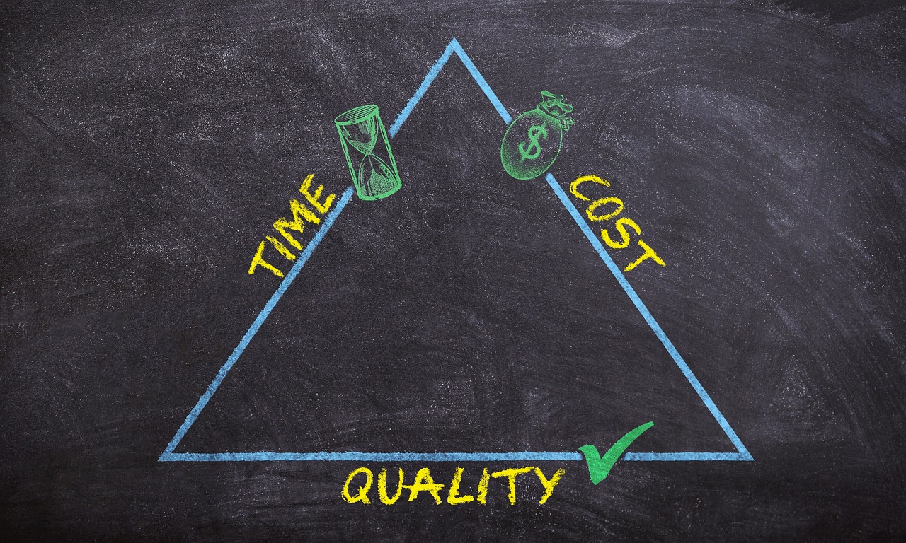
triangle, quality, time, cost, efficiently, business, projects, drawing, board, profit, optimization, management, budget, yield, lodestar, realize, how to calculate, draw, chalk, representation, magic triangle, graphic, triple constraint, resources, project triangle, target definition, part of the goal, production, duration of the project, stakeholders, balance, organization, process management, blue, yellow, black, texture, flexibility, goal, strategy, competence, dynamics, concept, innovation, product innovation, innovative, success, quality, quality, quality, quality, quality, cost, cost, cost, cost, budget, budget, budget, budget, resources
Photo by MR-PANDA on Pixabay

Before I look at the client at all, I look at my own calendar. How many hours will this take, honestly? I count the discovery calls, writing the brief, design rounds, building the theme, the small fixes after launch, and the emails in between. Emails always add up. For a full custom blog design with a logo and a set of page templates, I plan for 25 to 35 hours.

Then I pick the hourly rate that keeps my studio running. Rent, software, fonts, the accountant, the new monitor I bought last spring. My rate has moved three times in six years, and yours should move too. Write it down where you can see it.

Hourly rate or project price

stock, trading, monitor, business, finance, exchange, investment, market, trade, data, graph, economy, financial, currency, chart, information, technology, profit, forex, rate, foreign exchange, analysis, statistic, funds, digital, sell, earning, display, blue, accounting, index, management, black and white, monochrome, stock, stock, stock, trading, trading, trading, trading, trading, business, business, business, finance, finance, finance, finance, investment, investment, market, data, data, data, graph, economy, economy, economy, financial, technology, forex
Photo by 3844328 on Pixabay

Both have a place in a small studio.

When I bill by the hour, I get paid for every minute I work and a client with fuzzy scope can start with a small block of hours and see how it goes. The awkward part is that the client carries all the risk if my estimate turns out wrong, and they know it. Some of them watch the clock, and designing under a clock is miserable work.

So for anything with a shape I can see (a logo plus a theme, a brand pack, a media kit design), I quote a fixed project price nearly every time. The client hears one number before we start, and I carry the risk of my own estimate. Managing that risk well is part of what they are paying me for.

Hourly still appears in my studio for open-ended work: a retainer for monthly updates, or a day rate when someone needs me for launch week.

Write the scope down before you name the price

notes, paper, ball of paper, memo, office, write down, spiral binding, datailaufnahme, note, idea, discard, planning, decline, notes, memo, idea, idea, idea, idea, idea, planning, planning, planning, planning
Photo by congerdesign on Pixabay

The price follows the scope. Always in that order.

Before I quote, I write a short brief: which pages, how many design concepts, how many revision rounds, whether I’m coding the theme or only designing it, who handles the content, and the date the client owes me their photos and words. Two pages of text is usually enough. Both of us sign it, and I attach it to the invoice so there is exactly one version of the truth.

The brief is where pricing lives. A four-page blog with one concept round is a different project from a twelve-page magazine layout with custom illustration, and the price gap should be big enough that the client feels it.

Scope creep, and the polite way to stop it

Scope creep arrives dressed as small favors. A second logo variant, one more round of revisions, a shop page that was never in the brief, “just a quick template for newsletters.” Each one is genuinely small. Together they are a week of unpaid work.

My contract says two revision rounds are included and everything else is quoted separately. When a request lands outside the brief, I answer the same way every time: “Happy to do that. Here’s what it adds to the project.” No apology, no lecture. About a third of the time the client says actually the original version is fine, and everyone moves on.

I also keep a little menu of add-ons with prices on it (extra page template, shop styling, newsletter header, matching social graphics). Pricing extras in advance turns a negotiation into a selection.

Take a deposit

I take 40% before I open any design software, and the balance before handover. Files, logins, and export packages move after the final payment.

The deposit does three jobs. It funds the hours I’m about to spend, it tells me the client is real, and it makes both of us treat the start date as a commitment. In six years, the only two projects that collapsed were both deposit-less.

For bigger builds I split the balance into milestones: 40% up front, 30% at concept approval, 30% at launch. Smaller projects go 50/50. Either way, I never finish a project while waiting on money from it.

Getting paid without drama

I send a proper invoice the moment each milestone lands, with the due date spelled out and the accepted payment methods listed. Bank transfer and card payment both work fine. Card payments cost me a small processing fee on each transaction, so for tiny add-ons I quote round numbers that absorb it rather than adding a fee line the client has to read.

Late payers are rare when the paperwork is tidy. When someone drifts past the due date, one friendly reminder on day three and a firmer one on day ten usually settles it. My rule is that work pauses at day fourteen, and I say so in the contract so it never becomes a personal argument.

Raise your prices when the work gets better

My first custom design was 250 euro. The last one was eighteen times that, and the difference is almost entirely practice: faster hands, fewer wrong turns, better judgment about what a project needs.

Review your prices twice a year. If you are booked out more than a month ahead, your price is too low. If quoting a project still scares you a little, good. Price the work, send the quote, and let the client decide. Half of them will say yes, and the ones who say no were never going to be easy projects anyway.

The Five Pages Your Blog Needs Before You Write a Word

When I install a theme for a customer, the blog usually looks beautiful within an hour. Then I click the menu and find one lonely link sitting there. Posts will come, but four or five pages first will do more for your blog than any design tweak I could make. These are the pages I set up before writing a single word. They take an afternoon in total, and every one of them quietly works while you are asleep, or at your day job, or too tired to write.

About: the page everyone opens second

valentines day background, paper, heart, symbol, romance, valentine, love, open, page, book, inspiration, study, read, education, concept
Photo by DariuszSankowski on Pixabay

In my own studio blog’s stats, About is the second most visited page after the homepage, and it holds that spot month after month. People read a post they like, then want to know who wrote it. Give them a photo of your face instead of a logo, 150 to 250 words, and three things: what the blog is about, who it is for, and one true personal detail. I mention that I work from a kitchen table in Vilnius with a coffee going cold beside me. Specific beats polished. End the page with two or three links to posts you are proud of, so a curious reader has somewhere to go next.

Contact: make replying easy

make a phone call, mobile, phone, smartphone, communication, contact, iphone, community, accessible, at home, home, friendship, woman, female, home office, web, reception, talk, talking, chat, phone, communication, communication, communication, community, home office, talk, talk, talk, talking, talking, talking, talking, talking, chat
Photo by VinzentWeinbeer on Pixabay

Put a form or a visible email address in the menu, not buried at the bottom of a sidebar. Tell people when you answer. Mine says I read email on weekday mornings and usually reply within two days. It is also fine to name what you are open to (questions, collaboration, kind corrections) and what you will ignore. Mine says I don’t take guest posts, and that one sentence has saved me a hundred emails. If the same question keeps arriving, answer it on the page itself. My Contact page says which template runs my own blog, because three people a week asked.

Privacy: the page the law expects

europe, gdpr, privacy, data, security, regulation, law, protection, european, general, information, gray data, gray security, gray information, gray law, gdpr, gdpr, gdpr, gdpr, gdpr
Photo by TheDigitalArtist on Pixabay

If you use analytics, a mailing list, or ads, you collect visitor data, and readers are owed a plain explanation of what happens to it. The standard idea of a privacy policy is simply a statement of what you collect and what you do with it. For a hobby blog, three short paragraphs cover everything: which cookies and analytics run on the site, whether you share data with anyone (usually just your newsletter provider), and how a reader can ask you to delete theirs. Add the date you last updated it. Mine is 90 words long. If you run a mailing list, mention double opt-in there too: it is the checkbox that confirms a subscriber wants your emails, and it keeps you on the right side of the rules in Europe.

Start Here: the map of your best work

This page answers the question a new reader arrives with: where do I begin? Pick five to eight of your strongest posts, group them by theme (“Balcony gardening basics”, “My studio tools”, “Weekend projects”), and add one sentence of context per group. Update it quarterly as your archive grows. A Start Here page turns a one-time visitor into someone who reads three posts in one sitting. Link it from your footer as well as the menu, and mention it in the last line of your About page. It is the closest thing a blog has to a shop window.

Resources: the page that earns a little

List the tools you genuinely use: your camera, your host, the notebook on your desk, the exact template running on your blog. Add affiliate links where you have them, and say so in one line at the top of the page. Mine earns between EUR 40 and 60 a month, which covers hosting with enough left for flowers on the table. More than the money, it answers the question I get most often in email: “what do you use for this?” Review the page twice a year and cut anything you have quietly stopped using. A short honest list converts better than a long one padded with everything under the sun.

Set the order before the first post

Pages first, then posts. In the menu I use this order: Start Here, Blog, About, Resources, Contact, Privacy. Put Privacy in the footer too, where people expect to find it. Twenty minutes of setup on day one, and every post you write afterwards lands on a blog that looks like someone lives there.

Four pages or five, the point is the same. A stranger arrives, reads something they like, and has a clear next step. That is what turns a blog into a place people come back to.

Fonts That Don’t Fight Your Photos

Photography brings color, texture, and personality to a blog in a way no illustration can. Then a typeface shows up over it, and suddenly the header looks like a ransom note. In my studio I spend more time on this pairing than on any other design decision, because a good font pairing makes an ordinary photo look art-directed. Here’s how I do it.

Why type and photos clash

women, crowd, protest, protesters, people, protesting, garments clash, dhaka, bangladesh, women workers, female workers, aerial view, women, women, crowd, crowd, crowd, crowd, crowd, protest, bangladesh, bangladesh
Photo by 19661338 on Pixabay

Photos are busy. Even a calm portrait has light patches and dark patches, plus a background doing whatever it wants. Type is flat, solid, and sits right on top of that mess. The clash usually comes from three places: letterforms with thin hairlines (thin strokes vanish over a bright sky), a text color that matches the photo’s midtones, or a size too small to survive at phone scale. I learned the hairline lesson on a travel theme in 2021: the demo photo of a white chapel under midday sun sat beneath a white hairline serif, and the post title disappeared the moment a reader opened the page outdoors. Fix those three and most pairing problems disappear.

Contrast is your friend

phacelia, field of rapeseeds, bee pasture, bee friend, tufted beautiful, beautiful flowers, tufted flower, violet, flower, beekeeper plant, flower wallpaper, nature, blossom, bloom, purple, summer, spring, flower background, bloom, water leaf plant, color contrast, picturesque, close up, inflorescence, lilac, field
Photo by manfredrichter on Pixabay

If your photo is soft and romantic (blurred florals, warm skin tones), reach for a sturdy sans-serif. If the photo is sharp and graphic (architecture, flat lays with hard shadows), a high-contrast serif can carry the header. Light photo, dark type. Busy photo, plain type. One rule, and it solves more headers than any font list I could hand you.

The two-font rule

Every theme I sell ships with two typefaces: one for headings, one for body text. Cormorant Garamond with Karla is my wedding-blog pairing. Playfair Display with Montserrat when a client wants something louder. The trick is contrast between the two. A detailed serif needs a plain sans beside it, and a characterful sans needs a quiet serif. Two fonts from the same family usually blur together.

Let the photo pick your colors

bellies, daisy, glass, pick, blossoms, white, daisies, spring, nature, blossomed
Photo by manfredrichter on Pixabay

There is no need to invent a palette from scratch. Sample one color straight from the photo: the deep green in a leaf, the warm brown of a wooden table, the dusty blue of evening water. Use that single color for headings or links and the whole page feels composed, like someone planned it. I keep an eyedropper extension in my browser for exactly this, and it decides my accent colors faster than any mood board.

Size and spacing do half the work

Body text at 16px with 1.6 line-height, headings no smaller than 24px on phones, and lines kept to 60 or 70 characters. Over photos I bump headings up another 10% and add letter-spacing to small caps labels, around 0.1em. When header text still fights the photo, a black scrim at 60% opacity underneath settles it faster than swapping fonts five times.

Test on your real photos

Demo photos are lit by professionals. Yours are lit by a window in Vilnius at 4pm on a November afternoon (mine certainly are). Before I ship a pairing, I drop the customer’s own three worst photos into the header and read the type on a phone. If a single stroke disappears, the pairing goes back to the bench.

A few pairings I keep returning to

Cormorant Garamond and Karla for softness. Libre Baskerville and Work Sans for text-heavy blogs with few photos. DM Serif Display and DM Sans when a client wants one voice throughout. And my guilty favorite: a big italic serif for post titles, all lowercase, over a wide photo crop. That header style made my shop’s first year.

Photos and type want the same thing from each other: room. Give the photo a quiet corner for the type, give the type one solid color, and the two will hold hands.

How to Start a WordPress Blog in a Weekend

The banner over my old shop read “Start Your WordPress Blog In 5-Minutes.” I loved that line, and it was generous with the truth. You can buy a theme in five minutes. Building a blog you’ll still like next year takes a weekend, and a weekend is plenty. Here’s the plan I hand to friends.

Friday evening: the paperwork (30 minutes)

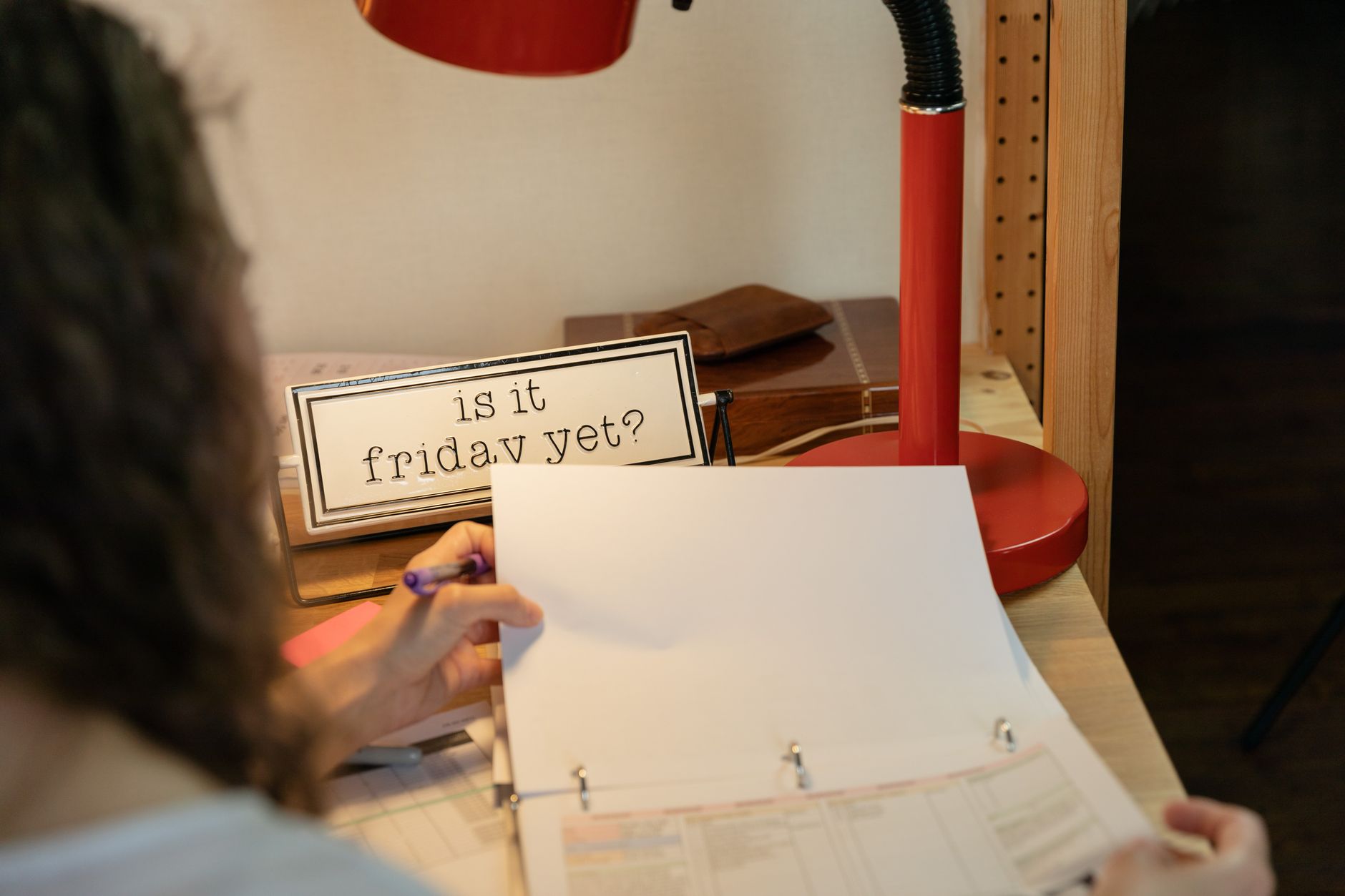
Cozy home office setup with red desk lamp, sign 'Is it Friday yet?', and person looking at documents.
Photo by RDNE Stock project on Pexels

Pick a name you can say out loud without spelling it. Check that the domain is free, then buy it along with hosting, roughly EUR 60 to 100 for the first year. Choose a host with a one-click WordPress installer, since FTP and databases are a Sunday night problem you don’t need. Write your logins somewhere you’ll actually find them again. At checkout, take domain privacy (it hides your home address from the public directory) and skip the rest of the add-ons. Pick the cheapest plan that includes a free SSL certificate, the padlock icon in the browser bar. Readers trust it and Google expects it.

Saturday morning: install and clean (1 hour)

Workers use a lift to install a large patterned carpet on a stone building facade.
Photo by Tahir Xəlfəquliyev on Pexels

Run the installer, then delete the sample stuff: the “Hello World” post, the sample page, the placeholder comments. Set your site title and tagline under Settings, General. Under Settings, Permalinks, choose “Post name” so your URLs read like sentences. Ten minutes of cleaning now saves you from a blog that still says “Just another WordPress site” in Google results.

Saturday afternoon: the theme (90 minutes)

yuyuantan park, lotus, the beginning of summer, saturday, saturday, saturday, saturday, saturday, saturday
Photo by alicepaipai on Pixabay

My favorite hour. Upload the theme you bought under Appearance, Themes, Add New, Upload Theme, activate it, and open the Customizer. Set exactly three things: your logo, your colors, your fonts. One accent color and two typefaces is a complete design. Everything else you want to add today, add next weekend instead. If you are torn between two themes, install both (most paid shops let you demo freely) and notice which one you enjoy opening. The theme you like touching is the theme you will keep updated.

Saturday evening: five pages and one post (1 hour)

Build About, Contact, Privacy, Start Here, and a plain Blog page, then arrange them in a menu under Appearance, Menus. Write one short post, 300 words is plenty, and publish it tonight. A blog with one real post looks more alive than a blog with twelve empty categories. Name the pages plainly, too. “Start Here” beats “My Journey” on any menu, because menu labels are signage, not poetry.

Sunday: the finishing touches (45 minutes)

Upload a favicon. Put a photo of yourself on the About page. Check the whole site on your phone, since half your readers will see it there first. Switch on backups (your host usually has a toggle for this), then book your next writing session in your calendar before you close the laptop.

Five hours across two days. My old banner promised five minutes, and five hours is what buys you a blog you won’t rebuild in six months.

What Six Years of Selling Blog Templates Taught Me

When I opened my little template shop in 2019, I figured the hard part would be the design. Six years later the shop is still small, still run from my kitchen table in Vilnius, and I’ve sold premade Blogger templates and WordPress themes to a few thousand hobby bloggers. The design was the easy part. Here’s what actually took work.

Pretty sells the click, tidy sells the theme

pretty woman, portrait, hands, pretty, face, skin
Photo by panajiotis on Pixabay

My first three templates were gorgeous and broken. Slow to load, widgets in odd corners, a footer nobody could edit without opening code. Sales picked up only when I gave the boring structure the same hours I gave the look. Whitespace, consistent margins, an obvious home for a photo. People buy the screenshot of the demo blog. They keep the theme because it behaves.

Hobby bloggers have real constraints

yarn, wool, handwork, hobby, crochet, yarn, yarn, yarn, yarn, yarn, wool, wool, wool, crochet, crochet, crochet
Photo by congerdesign on Pixabay

My customers write in the evenings, after work, often after the kids are asleep. They get maybe two hours on a Saturday. They will not read a 40-page setup guide, and I don’t blame them. So my install notes shrank every year, down to one page with screenshots. The theme that sells best is the one I can explain fastest.

One font too many is one font too many

Detailed view of different font styles printed on paper, showcasing typography.
Photo by Brett Jordan on Pexels

Early on I bundled five fonts per theme because it felt generous. Customers changed two and the whole design fell apart. Now every theme ships with two typefaces and a short note about why I paired them. Restraint reads as confidence.

Support is the product

I answer email myself, usually within a day. Nine times out of ten the question is tiny (“where do I change the header photo?”), and a kind answer turns a customer into someone who tells a friend. I have repeat buyers on their third and fourth theme, one for each season of their blog.

Prices can be simple

I used to run sales, coupons, and bundle tiers. It confused everyone, including me. Now: one price per theme, free updates, a small fee if you want me to install it for you. Revenue went up when the pricing page got shorter.

Six years in, my studio is one person, one laptop, and a lot of pink sticky notes. The work that lasts respects someone’s Saturday morning.

© 2026 Kotryna Bass

Theme by Anders Noren — Up ↑