Photography brings color, texture, and personality to a blog in a way no illustration can. Then a typeface shows up over it, and suddenly the header looks like a ransom note. In my studio I spend more time on this pairing than on any other design decision, because a good font pairing makes an ordinary photo look art-directed. Here’s how I do it.
Why type and photos clash

Photos are busy. Even a calm portrait has light patches and dark patches, plus a background doing whatever it wants. Type is flat, solid, and sits right on top of that mess. The clash usually comes from three places: letterforms with thin hairlines (thin strokes vanish over a bright sky), a text color that matches the photo’s midtones, or a size too small to survive at phone scale. I learned the hairline lesson on a travel theme in 2021: the demo photo of a white chapel under midday sun sat beneath a white hairline serif, and the post title disappeared the moment a reader opened the page outdoors. Fix those three and most pairing problems disappear.
Contrast is your friend
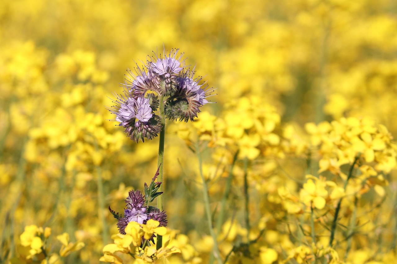
If your photo is soft and romantic (blurred florals, warm skin tones), reach for a sturdy sans-serif. If the photo is sharp and graphic (architecture, flat lays with hard shadows), a high-contrast serif can carry the header. Light photo, dark type. Busy photo, plain type. One rule, and it solves more headers than any font list I could hand you.
The two-font rule
Every theme I sell ships with two typefaces: one for headings, one for body text. Cormorant Garamond with Karla is my wedding-blog pairing. Playfair Display with Montserrat when a client wants something louder. The trick is contrast between the two. A detailed serif needs a plain sans beside it, and a characterful sans needs a quiet serif. Two fonts from the same family usually blur together.
Let the photo pick your colors
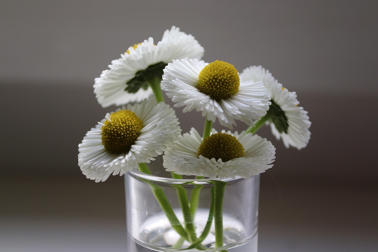
There is no need to invent a palette from scratch. Sample one color straight from the photo: the deep green in a leaf, the warm brown of a wooden table, the dusty blue of evening water. Use that single color for headings or links and the whole page feels composed, like someone planned it. I keep an eyedropper extension in my browser for exactly this, and it decides my accent colors faster than any mood board.
Size and spacing do half the work
Body text at 16px with 1.6 line-height, headings no smaller than 24px on phones, and lines kept to 60 or 70 characters. Over photos I bump headings up another 10% and add letter-spacing to small caps labels, around 0.1em. When header text still fights the photo, a black scrim at 60% opacity underneath settles it faster than swapping fonts five times.
Test on your real photos
Demo photos are lit by professionals. Yours are lit by a window in Vilnius at 4pm on a November afternoon (mine certainly are). Before I ship a pairing, I drop the customer’s own three worst photos into the header and read the type on a phone. If a single stroke disappears, the pairing goes back to the bench.
A few pairings I keep returning to
Cormorant Garamond and Karla for softness. Libre Baskerville and Work Sans for text-heavy blogs with few photos. DM Serif Display and DM Sans when a client wants one voice throughout. And my guilty favorite: a big italic serif for post titles, all lowercase, over a wide photo crop. That header style made my shop’s first year.
Photos and type want the same thing from each other: room. Give the photo a quiet corner for the type, give the type one solid color, and the two will hold hands.